1
2
3
4
5
6
7
8
9
10
11
12
13
14
15
16
17
18
19
20
21
22
23
24
25
26
27
28
29
30
31
32
33
34
35
36
37
38
39
40
41
42
43
44
45
46
47
48
49
50
51
52
53
54
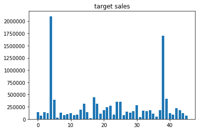
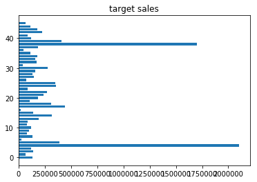
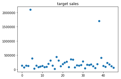
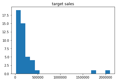
| 0 135000.0
1 70000.0
2 140000.0
3 121176.0
4 2100000.0
5 390000.0
6 30000.0
7 130000.0
8 83000.0
9 100000.0
10 120000.0
11 80000.0
12 90000.0
13 195000.0
14 315000.0
15 140000.0
16 20000.0
17 440940.0
18 310000.0
19 108666.0
20 183206.0
21 240000.0
22 270000.0
23 85000.0
24 357628.0
25 350000.0
26 75000.0
27 147600.0
28 133676.0
29 160000.0
30 280000.0
31 40000.0
32 170000.0
33 160000.0
34 180000.0
35 110000.0
36 50000.0
37 185000.0
38 1700000.0
39 410000.0
40 120000.0
41 90000.0
42 225000.0
43 180000.0
44 115000.0
45 65000.0
Name: TC12月销售目标, dtype: float64
import matplotlib.pyplot as plt
bar_height = sales.values
bar_weight = np.arange(46)
fig,ax = plt.subplots()
ax.bar(bar_weight,sales,0.75)
plt.title("target sales")
plt.show()
|