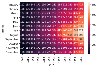
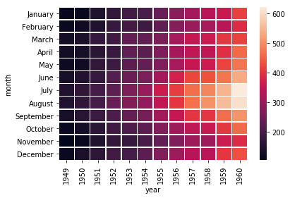
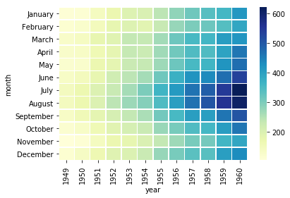
0%

1
2
3
4
5
6
7
8
9
10
11
import numpy as np
import pandas as pd
import matplotlib.pyplot as plt
import matplotlib as mpl
import seaborn as sns

sns.set(color_codes=True)

np.random.seed(sum(map(ord,"regression")))
tips = sns.load_dataset("tips")
tips.head()
total_bill tip sex smoker day time size
0 16.99 1.01 Female No Sun Dinner 2
1 10.34 1.66 Male No Sun Dinner 3
2 21.01 3.50 Male No Sun Dinner 3
3 23.68 3.31 Male No Sun Dinner 2
4 24.59 3.61 Female No Sun Dinner 4

regplot()和lmplot()都可以绘制回归关系,推荐使用regplot()

1
2
sns.regplot(x = "total_bill",y="tip",data=tips)
<matplotlib.axes._subplots.AxesSubplot at 0x1a17cb5668>

png

1
2
sns.regplot(data=tips,x="size",y="tip")
<matplotlib.axes._subplots.AxesSubplot at 0x1a17bf8ac8>

png

1
2
sns.regplot(data=tips,x="size",y="tip",x_jitter=0.05)
<matplotlib.axes._subplots.AxesSubplot at 0x1a17e29b70>

png

# seaborn

1
2
3
4
5
6
import pandas as pd
import numpy as np
import matplotlib as mpl
import matplotlib.pyplot as plt
import seaborn as sns
sns.set(style = "whitegrid",color_codes=True)
1
2
3
4
5
tips = sns.load_dataset("tips")
iris = sns.load_dataset("iris")
titanic = sns.load_dataset("titanic")
sns.stripplot(x="day",y="total_bill",data=tips)
<matplotlib.axes._subplots.AxesSubplot at 0x10de58518>

png

重叠很正常,但是影响观察数据量。

1
2
sns.stripplot(x="day",y="total_bill",data=tips,jitter=True)
<matplotlib.axes._subplots.AxesSubplot at 0x108208b00>

png

1
2
sns.swarmplot(x="day",y="total_bill",data=tips)
<matplotlib.axes._subplots.AxesSubplot at 0x1a1ac1a7b8>

png

1
2
sns.swarmplot(x="day",y="total_bill",hue="sex",data=tips)
<matplotlib.axes._subplots.AxesSubplot at 0x1a1ac68d30>

png

1
2
sns.violinplot(x="total_bill",y="day",hue="time",data=tips)
<matplotlib.axes._subplots.AxesSubplot at 0x1a1ad26390>

png

1
2
sns.violinplot(x="total_bill",y="day",hue="sex",data=tips,split=True)
<matplotlib.axes._subplots.AxesSubplot at 0x1a1af157b8>

png

1
2
3
sns.violinplot(x="day",y="total_bill",data=tips,inner=None)
sns.swarmplot(x="day",y="total_bill",data=tips,color='w',alpha=0.5)
<matplotlib.axes._subplots.AxesSubplot at 0x1a1b4a4f60>

png

1
2
3
titanic
sns.barplot(x="sex",y="survived",data=titanic,hue="class")
<matplotlib.axes._subplots.AxesSubplot at 0x1a1b7ba0b8>

png

点图可以很好的描绘数据的差异

1
2
sns.pointplot(x="sex",y="survived",hue = "class",data=titanic)
<matplotlib.axes._subplots.AxesSubplot at 0x1a1b9f2860>

png

1
2
3
#多层面板分类图
sns.factorplot(x="day",y="total_bill",hue="smoker",data=tips)
<seaborn.axisgrid.FacetGrid at 0x1a1b884d30>

png

1
2
sns.factorplot(x="day",y="total_bill",hue="smoker",data=tips,kind="bar")
<seaborn.axisgrid.FacetGrid at 0x1a1bb5b710>

png

1
2
sns.factorplot(x="day",y="total_bill",hue="smoker",data=tips,kind="swarm",col="time")
<seaborn.axisgrid.FacetGrid at 0x1a1be4dac8>

png

1
2
sns.factorplot(x="day",y="total_bill",hue="smoker",data=tips,kind="box",col="day",size=4,aspect=0.5)
<seaborn.axisgrid.FacetGrid at 0x1a1c0a5588>

png

# seaborn

1
2
3
4
5
import pandas as pd
import numpy as np
import matplotlib as mpt
import matplotlib.pyplot as plt
import seaborn as sns
1
2
tips=sns.load_dataset("tips")
tips.head()
total_bill tip sex smoker day time size
0 16.99 1.01 Female No Sun Dinner 2
1 10.34 1.66 Male No Sun Dinner 3
2 21.01 3.50 Male No Sun Dinner 3
3 23.68 3.31 Male No Sun Dinner 2
4 24.59 3.61 Female No Sun Dinner 4
1
2
g=sns.FacetGrid(tips,col="time")
<seaborn.axisgrid.FacetGrid at 0x1a1155f0f0>

png

1
2
3
g=sns.FacetGrid(tips,col="time")
g.map(plt.hist,"total_bill")
<seaborn.axisgrid.FacetGrid at 0x1a1d6a5748>

png

1
2
3
4
g = sns.FacetGrid(tips,col="sex",hue="smoker")
g.map(plt.scatter,"total_bill","tip",alpha=0.7)
g.add_legend()
<seaborn.axisgrid.FacetGrid at 0x1a1e19c0f0>

png

1
2
3
g = sns.FacetGrid(tips,col="time",row="smoker",margin_titles=True)
g.map(sns.regplot,"size","total_bill",color="0.3",fit_reg=False,x_jitter=0.1)
<seaborn.axisgrid.FacetGrid at 0x1a1eb23d68>

png

1
2
3
4
5
6
7
8
9
10
g = sns.FacetGrid(tips,col="day",size=4,aspect=0.5)
g.map(sns.barplot,"sex","total_bill")
/anaconda3/lib/python3.6/site-packages/seaborn/axisgrid.py:703: UserWarning: Using the barplot function without specifying `order` is likely to produce an incorrect plot.
warnings.warn(warning)


<seaborn.axisgrid.FacetGrid at 0x1a21180d30>

png

1
2
3
4
5
6
7
8
9
10
11
12
13
14
15
16
17
from pandas import Categorical
order_days = tips.day.value_counts().index
print(order_days)
order_days = Categorical(["Thur","Fri","Sat","Sun"])
g = sns.FacetGrid(tips,row="day",row_order=order_days,size=1.7,aspect=4)
g.map(sns.boxplot,"total_bill")
CategoricalIndex(['Sat', 'Sun', 'Thur', 'Fri'], categories=['Thur', 'Fri', 'Sat', 'Sun'], ordered=False, dtype='category')


/anaconda3/lib/python3.6/site-packages/seaborn/axisgrid.py:703: UserWarning: Using the boxplot function without specifying `order` is likely to produce an incorrect plot.
warnings.warn(warning)


<seaborn.axisgrid.FacetGrid at 0x1a1e4168d0>

png

1
2
3
4
5
pal = dict(Lunch="seagreen",Dinner="blue")
g = sns.FacetGrid(tips,hue="time",palette=pal,size=5)
g.map(plt.scatter,"total_bill","tip",s=50,alpha=0.7,linewidth=0.5,edgecolor="white")
g.add_legend()
<seaborn.axisgrid.FacetGrid at 0x1a2201f8d0>

png

1
2
3
4
5
6
with sns.axes_style("white"):
g=sns.FacetGrid(tips,row="sex",col="smoker",margin_titles=True,size=2.5)
g.map(plt.scatter,"total_bill","tip",color="#334488",edgecolor="white",lw=0.5)
g.set_axis_labels("total_bill(Us dollar)","tips")
g.set(xticks=[10,30,50],yticks=[2,6,10])
g.fig.subplots_adjust(wspace=0.02,hspace=0.02)

png

1
2
3
4
iris = sns.load_dataset("iris")
g = sns.PairGrid(iris)
g.map(plt.scatter)
<seaborn.axisgrid.PairGrid at 0x1a21f379e8>

png

1
2
3
4
g = sns.PairGrid(iris)
g.map_diag(plt.hist)
g.map_offdiag(plt.scatter)
<seaborn.axisgrid.PairGrid at 0x1a21a84b00>

png

1
2
3
4
5
g = sns.PairGrid(iris,hue="species")
g.map_diag(plt.hist)
g.map_offdiag(plt.scatter)
g.add_legend()
<seaborn.axisgrid.PairGrid at 0x1a23793860>

png

1
2
3
g = sns.PairGrid(iris,hue="species",vars=["sepal_length","sepal_width"])
g.map(plt.scatter)
<seaborn.axisgrid.PairGrid at 0x1a24382550>

png

1
2
3
4
g = sns.PairGrid(tips,hue="size",palette="GnBu_d")
g.map(plt.scatter,s=50,edgecolor="white")
g.add_legend()
<seaborn.axisgrid.PairGrid at 0x1a26982c88>

png

# seaborn

1
2
3
4
5
import numpy as np
import pandas as pd
import matplotlib.pyplot as plt
import seaborn as sns
%matplotlib inline
1
2
3
4
5
6
7
8
9
10
11
12
data = np.random.rand(3,3)
print(data)
heatmap = sns.heatmap(data)
[[0.79738421 0.16230573 0.06197724]
[0.79989397 0.73146068 0.17731879]
[0.26202278 0.78645707 0.26536331]]


<matplotlib.axes._subplots.AxesSubplot at 0x10d042a90>

png

1
2
#设置数据最小值到最大值界限
ax = sns.heatmap(data,vmin=0.1,vmax=0.5)

png

1
2
3
4
5
6
7
#当数据有正负时,可以指定以0为中心
data = np.random.randn(3,3)
print(data)
ax = sns.heatmap(data,center=0)
[[ 0.65257565 -0.38550847 0.55620784]
[ 0.28429021 -1.68905002 -0.29115511]
[-1.09649997 -0.81622564 0.47706824]]

png

1
2
flights = sns.load_dataset("flights")
flights.head()
year month passengers
0 1949 January 112
1 1949 February 118
2 1949 March 132
3 1949 April 129
4 1949 May 121
1
2
3
4
5
#数据转换
flights = flights.pivot("month","year","passengers")
#热力图
sns.heatmap(flights)
<matplotlib.axes._subplots.AxesSubplot at 0x1a1a0a5ac8>

png

1
2
#将数据显示在heatmap中,annot=True,将fmt的值设置为'd',否则数据会出现乱码。
ax = sns.heatmap(flights,annot=True,fmt='d')

png

1
2
#heatmap格与格之间增加间隙
ax = sns.heatmap(flights,linewidth=0.5)

png

1
2
#设置自定义颜色
ax = sns.heatmap(flights,linewidth=0.5,cmap="YlGnBu")

png

# seaborn # heatmap

1
2
3
import matplotlib.pyplot as plt
import numpy as np
from sklearn import datasets
1
2
3
4
5
6
7
8
9
10
11
12
13
14
15
16
17
18
19
20
21
22
23
24
25
26
27
28
29
30
31
32
33
34
35
36
37
38
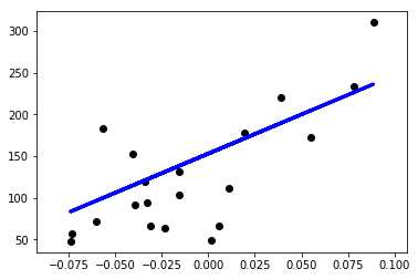
class LinearRegression():
def __init__(self):
self.w=None

def fit(self,X,y):
print(X.shape)
X=np.insert(X,0,1,axis=1)
print(X.shape)
X_=np.linalg.inv(X.T.dot(X))
self.w = X_.dot(X.T).dot(y)

def predict(self,X):
X=np.insert(X,0,1,axis=1)
y_pred = X.dot(self.w)
return y_pred

def mean_squared_error(y_true,y_pred):
mse = np.mean(np.power(y_true-y_pred,2))
return mse

def main():
diabetes = datasets.load_diabetes()
X = diabetes.data[:,np.newaxis,2]
print(X.shape)
x_train,x_test = X[:-20],X[-20:]
y_train,y_test = diabetes.target[:-20],diabetes.target[-20:]

clf = LinearRegression()
clf.fit(x_train,y_train)
y_pred = clf.predict(x_test)

plt.scatter(x_test[:,0],y_test,color='black')
plt.plot(x_test[:,0],y_pred,color='blue',linewidth=3)
plt.show()
main()
(442, 1)
(422, 1)
(422, 2)

png

# 线性回归